Font used on government & legal document: Guide & recommendations
Why are government document fonts important?
Anyone who has worked with legal documents in the past knows that many specifications regarding layout and wording must be adhered to. This can ensure that documents retain their validity and that subsequent corrections can be avoided.
One of the specifications deals with the question of which font is used on a government document. Many clerks use the classic Times New Roman, which has been the standard for documents of all kinds for many years. The good news is that there are no legal requirements for the choice of fonts for official documents. However, some best practices should be followed to give a professional impression to the outside world.
An official letter's font must essentially satisfy one simple requirement: It must be easy to read. It's not a good idea to use a font that looks nice but is difficult to read. However, there is no need to be concerned. Since there are several fonts to choose from. In the following paragraphs, we will show you some aspects to consider when making your choice.
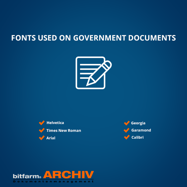
What is the font used in official & legal documents?
Arial and Times New Roman are two fonts that are truly universal for nearly every business document. Both are legible and simple. However, there are differing viewpoints on these two fonts.
Some people admire the classics and can testify to their seriousness and professionalism. Others, on the other hand, have grown tired of these fonts and considered them monotonous and outdated. Furthermore, the sender is often accused of not giving much attention to the recipient's appearance. If you dont want to use the two mentioned fonts, you might take a look at these:
- Helvetica
- Georgia
- Garamond
- Calibri
For official letters, a font size of 11 or 12 point is used as a rule of thumb. However, in the end, it is always dependent on the font chosen. And, even though the size is set to the same, the size will vary greatly depending on the font. Since certain ones are actually larger than others, this is the case.
Another aspect to consider is the choice between serif and sans serif. Serif is best for written texts, while sans serif is better for text that will be viewed and read on a computer screen because they are more readable.
What fonts should never be used for government documents?
A business text, as previously said, must be well-structured and easy to read. It should also give off a serious and professional vibe. This means that any fonts that are too whimsical, ornate, or difficult to read for other purposes would be rejected.
Cursive fonts and ones that tend to be too casual are also not acceptable. As a result, the sender should avoid the following fonts in an official letter:
- Bradley Hand ITC
- Courier New
- Impact
- Comic Sans MS
Do you need a (government) document management system to manage all of your private and commercial documents? We glady invite you to our YouTube series (please enable english subtitles) and are looking forward to your E-Mail regarding any questions about the topic of document management.
Glossary index | Home | Software | Services | Document Management | FAQ | Contact